This is the last of three blog posts about my initial experience using Aperture 3. Please read this in conjunction with Using Aperture 3: Part 1 and Using Aperture 3: Part 2.
Note: Since posting the first two parts, I've received a few comments and emails from people who've installed updates 3.0.1 and 3.0.2 and are either experiencing fewer issues or none at all. I still have most of the issues I've written about, but that could possibly be due to the fact that I built much of my Lembeh Library prior to the updates. In any case, please note that "performance may vary", as the marketing slogan goes.
When Apple first announced Aperture 3, the one feature among the "over 200" new features touted by the company that really got me excited was the potential for creating multimedia output. Here's why.
For the past several years, I've been experimenting with putting together photographs, video, audio and text into slideshows, short videos, and other multimedia presentation formats, because I saw at a relatively early stage the creative potential being unlocked by rapid advances in digital technology.
Whereas print was print, video was video, and audio was audio in the analogue world many of us grew up in, the digitisation in recent years of print (via computers), photographs, video and audio has (a) democratised the availability of affordable hardware, (b) led to a boom in software development to empower all the new hardware, and (c) shifted to a great extent the barrier-to-entry for content creation away from capital ($$$) and circumstance (connections, brown-nosing) toward creativity (brains).
We're still at the very early stages of this transformation, but this change in paradigm is the primary driver behind the difficulties many "old" media businesses (record companies, newspapers, magazines, book stores, etc.) are experiencing, and is also the impetus underpinning the boom in "new" media businesses (online retailers, social networking communities, online video, etc.).
Those who "get it" and adapt will flourish. Those who don't will languish.
Ok, enough Darwinian analysis.
The point I'm homing in on is that going forward, content creators must be fluent in as many forms of media as possible, and that with the widespread availability of inexpensive content-creation tools becoming the norm, the storytelling element of content creation becomes more important than ever, as content quality (as opposed to hardware monopoly) becomes the dominant distinguishing factor.
To put this more simply…if you're a content creator and can't be original and creative, forget it. Hardware isn't expensive and scarce enough anymore to keep everyone else down, and there are a lot of talented, driven people out there.
Yes, I realise I'm overstating the case. But I'm positive that the core argument holds, which is the reason that Apple's announcement of Aperture 3's ability to manage photos, video and audio, plus edit all three together into a single output…was such a big deal to me.
Up to this point, in order to create multimedia output, I had to struggle…not just with hardware, but also with a multitude of software packages and file formats...and otherwise just spend far too much time worrying about logistics instead of focusing on the quality of my content.
Aperture 3 promised to change much of that.
Self-assigned Project
The problem with being at the cutting edge is that quite often, no one is willing to pay you to try new things. This is especially true in Asia, where one prevalent cultural motif is "Don't Think Different.", to mis-paraphrase one of my favourite grammatical errors.
I've been explaining the concepts I outlined above to every company I work with in Asia for years…to no avail. For the most part, the young people get it, but the older people in charge of decisions and budgets usually want nothing to do with the internet or multimedia, or they often appear to prefer sticking their heads in the sand and hoping it all just goes away and stops bothering them. Sigh.
What this means is that I have to create my own motivation and find ways to keep up with new developments, even if there's no obvious near-term financial incentive.
So when Apple announced Aperture 3, I downloaded the update immediately and started playing. The timing was fortuitous, as I was about to head to the Lembeh Strait for several weeks. I assigned myself the goal of using Aperture 3 to create a multimedia slideshow/ video from the material I gathered during the trip.
The Big Picture
Overall, I'm absolutely delighted that Apple took this step. My understanding is that Adobe has also added the ability to work with video in the latest beta release of Lightroom (Caveat: I have not played with Lightroom at all.). This is a positive trend, kickstarted by Aperture 3.
The Slideshow (File, New, Slideshow) function in Aperture 3 definitely works. In fact, if you create a Slideshow with just photographs, it seems to work quite well. I tested the Classic and Ken Burns themes and found them pretty easy to use.
The primary learning curve is figuring out the control panel on the right side of the screen when you go into Slideshow mode. It's not complicated though.
When you create a Slideshow, you'll see that there's a Default Settings tab, with which you can set the parameters for your Slideshow (you can also set these via the menu Aperture, Presets, Slideshow). You should ideally do this before bringing in your images (Quick aside: to bring in your images, all you have to do is drag-and-drop from your Project(s)), but you can always jigger your Default Settings at any point.
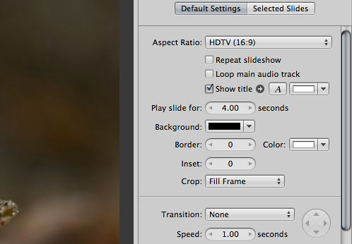
The parameters most important to me were Aspect Ratio, slide duration, Crop and Transition...all very easy to understand.
After you bring a photo into the Slideshow, you can edit each individual photo's settings with the Selected Slides tab. So...you determine overall settings with Default Settings, and tailor each slide with Selected Slides. Easy and logical.
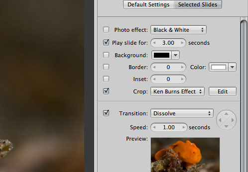
The Ken Burns Effect (which you use to pan, zoom in and out of a photo) works well, which makes it easy to add a dash of movement to still images.
If you make use of this function, be careful not to overdo it. The idea is to sprinkle in enough motion to lead the viewer's eye where you want it to go, but not so much motion that it becomes a distraction or crosses a line to become irritating.
It's also fairly easy to add text to your slides in Aperture 3. I used the built-in text generator for the closing credits in my Lembeh Night Safari video.
There were, however, a couple of things I found somewhat user-unfriendly.
1. Screen Layouts
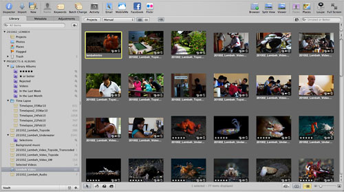
Aperture has three basic screen layouts that I use. Browser:
Viewer:
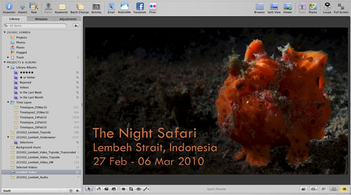
Split View:
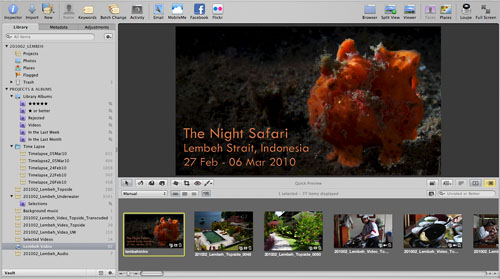
In the course of editing my Slideshow, I cycled among these screen layouts (using the V Cycle View Mode shortcut key). Browser is the easiest for locating specific images quickly; Viewer is best for concentrating on a single slide; Split View lets you follow the flow of your Slideshow in context with what comes before and after the slide you're looking at.
Here's the tricky part.
When you're working on a Slideshow, there's another view that looks like a derivative of the Split View. It's the screen you use to edit the actual Slideshow:
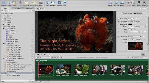
Confusingly, there doesn't seem to be a specific name assigned to this view in the menu, so you can't go straight to it via the menu (or if there is, I can't figure it out).
To aggravate matters, if you don't have background music/ sound in your Slideshow yet (the green area in the screenshot above, which I didn't add until the end of my editing process), this un-named Slideshow editing mode looks an awful lot like the ordinary Split View.
The screenshot below is of the Slideshow screen without the green music track. Compare that to the screenshot of the Split View two images above.
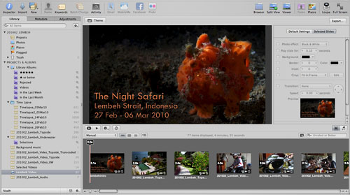
The editing dialogue on the right side distinguishes this view from the Split View, but if you're cycling through rapidly trying to select photos, re-arrange them, and then edit the Slideshow...it gets confusing.
I ended up using the little toggle buttons highlighted below to switch back-and-forth between Split View and the Slideshow editing screen...a bit of a pain...and I still can't always get to the view/ screen I want quickly without cycling through extra screens or making a mistake and having to fumble with buttons a bit to get the correct view:
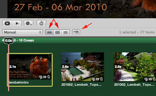
This screen ambiguity and user-unfriendly interface is by no means a fatal flaw, but it's certainly something I hope Apple will change with an update. I'd prefer to see the screen for Slideshow editing to be assigned a name...something dead-obvious like, say, Slideshow Edit...and that it be added to the View menu, and automatically become part of the cycled-through screens when you use the V shortcut key (appearing as an active choice only when you're working on a Slideshow).
That way, people already familiar with the Aperture shortcut keys could just stick to using the V key to change views, instead of fumbling with buttons.
2. Adding Slides
One other annoyance was the fact that it seems like you can only add photos to the end of your Slideshow.
Let's say I have forty images lined up already in my Slideshow, and I decide that I really must add another image between photographs twelve and thirteen.
When I drag and drop a photo into the Slideshow, it goes to the end of the queue and becomes number forty-one.
This happens even if I select slide twelve before dragging and dropping a new image, or if I place the playhead/ timeline indicator at a position between slides twelve and thirteen before dragging and dropping.
So what I'd end up having to do is drag-and-drop a new photo into the Slideshow, cycle into Browser mode, move the photo manually up through the existing slides to position it between twelve and thirteen, then cycle back to the Slideshow editing screen to edit the slide.
Again, not a deal-killer, but something that could be improved. Having the ability to choose exactly where I want to drop a new slide seems like a no-brainer, must-have capability.
Video and Audio
The real test, of course, came with how Aperture 3 handled video and audio files. On a scale from 1 to 10, with 1 being piss-poor and 10 being out-of-this-world, I'd give Aperture a rating of somewhere between 6 and 7, meaning better than just "ok", but not a hit out-of-the-park.
Some explanation of the areas I think need improvement:
1. Limited Trim/ Edit Capability
Aperture 3 gives you the ability to Trim video and audio clips, which translates into being able to lop off unwanted front and back ends of clips.
This is an essential feature to have in a multimedia-management software package, but there are limitations to what you can do right now with Trim in Aperture 3.
The Trim tool is rough. You call the Trim tool up with the little gear control to the right of the playhead for your video. As you can see from the screenshot below, you can adjust the yellow highlighted area to determine which portions of your video you want to use.
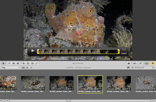
Dragging the yellow area to select what you want and don't want is easy, but you don't really have fine control. It's more like doing a rough cut, which, to be fair, is probably more than enough for most people and most circumstances.
The thing is, if Aperture 3 is meant to be a "professional" application, the Trim tool doesn't provide sufficient control.
To draw a parallel with photo editing, it'd be something akin to Aperture 3 providing you with the ability to apply contrast to a photo, but not providing Curves for fine-tuning or Brushes for selective application. Probably ok for most people most of the time, but not ideal for professional users.
2. Volume Control
When you bring a video clip into the Slideshow view, the editing dialogue recognises that you have a video clip, and it provides you with options for controlling volume, as shown here:
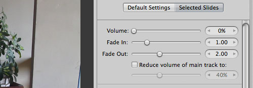
The control for the absolute Volume level works well, though there is no visual feedback to give you an idea of whether the volume is too high or too low, so you just have to play it by ear (I know...bad joke).
The Fade In and Fade Out functions work, but leave something to be desired. You can't directly control the audio levels, so the fading is imprecise. Fade Out, for instance, sometimes resulted in an abrupt, jarring drop of sound at the end of a clip.
To be fair to Apple, it's the nature of working with audio. There can be sudden changes in audio levels, which a canned Fade In or Fade Out system can't anticipate.
But again, like my comment about the Trim function above, I can't help but feel that such a "rough cut" approach isn't in keeping with positioning Aperture 3 as software for media professionals.
As a result of the inability to fine-tune audio, I had to export one video clip (the ending sequence with the staff of Kasawari Lembeh Resort) and edit the audio in Final Cut Express, then re-import the edited file to Aperture 3 and insert into my Slideshow timeline.
The same thought applies to the program's Reduce volume of main track to: function, which is basically ducking (translation: temporarily reducing the volume of background music to highlight other audio, like a voiceover).
To the extent I tested this function, it worked well, but the duck-in and duck-out times and levels are fixed, so there's no nuance control available.
I thought about layering in ambient sound recordings and possibly a bit of narration, but in the end decided that I probably wouldn't like the lack of control over the ducking function, so I binned that idea.
3. Video Playback
A more significant problem I experienced had to do with playing back and reviewing my slideshow in real time, with all the transitions and video/ audio intact.
I think (though I'm not 100% certain) that with photos alone, there would not have been any issue.
Whenever the playhead hit a video clip, however, playback of the video clip either stalled, skipped, or...Aperture crashed.
The crashing happened so often toward the end of my Slideshow creation process that I nearly gave up. Let's just say I was tense and emotional for a prolonged and aggravated period.
I had already installed updates 3.0.1 and 3.0.2 by that stage in my editing process. I just tested my Slideshow again now (after installing the OS X 10.6.3 update), but the issue still exists (the octopus between seconds 6 and 25):
Again, to be fair to Apple, the video clips are H.264 .mov files straight out of Canon 5D MkII and 7D cameras, which isn't the most user-friendly format. It's well-documented by now that you need to transcode Canon DSLR clips to a more editing friendly format to work with the video in Final Cut Pro or Final Cut Express, so it's asking a lot of Aperture 3 to handle the clips un-transcoded.
In a way, it's impressive that Aperture can manage such clips.
I transcoded a few clips to Apple Intermediate Codec (I don't have ProRes because I only have Final Cut Express installed) to see what would happen, but I didn't notice much of a difference. That could've been due to the un-transcoded clips remaining in the timeline though. To be honest, I didn't have it in me to transcode everything and re-construct the slideshow to do a more thorough test.
As a result of this issue, I didn't use the neat little function of fine-tuning image and video timing to match to the background music..."Tap out the time of your fades and cuts", as Apple describes it.
With the video tracks skipping and stalling constantly, it just wasn't feasible, no matter how much I wanted to try this intriguing function.
4. Background Music/ Main Audio Track
The last major thing I want to mention concerns the main audio track.
Adding a main audio track for background music is straightforward...just drag-and-drop. Working with the audio track isn't as gratifying though.
Beyond the overall Volume control and general Fade In, Fade Out (the same controls I discussed above in the relation to volume control for video clips), you can't tweak sound levels.
Also, it doesn't seem like you can place the main audio track anywhere except the very beginning of your Slideshow. So for instance, if you wanted five seconds of silence before your music gradually fades in...it's not possible (without the help of an external editing program).
Perhaps I've missed something, because the Help menu seems to suggest that it is possible to place the main audio track at any point you choose:
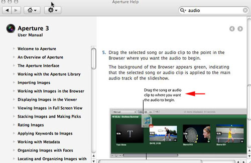
The caption says: "Drag the song or audio clip to where you want the audio to begin."
I tried every which way I could think of, but I couldn't get the main audio track to start anywhere but the very beginning.
Perhaps this caption applies only to secondary audio tracks (like voiceover tracks), which you can drag in and place in the body of the Slideshow (In which case, however, the illustration in the screenshot above would be misleading, as it was associated with the explanation of the main audio track).
Finally, once I added the main audio track, "Aperture quit unexpectedly" every few minutes. Testing just now, after having installed the recent OS X 10.6.3 update, Aperture seems more stable in this regard, though it's difficult to be sure without editing an entire Slideshow from scratch.
Conclusion
Ok, that's probably more than enough to give you a reasonable idea of what working with Aperture 3 was like for me the first time around, both the pros and cons.
I didn't cover everything I liked and didn't, but I think I got most of the important stuff.
To summarise my primary take-away points:
1. Aperture 3's photo-editing capabilities have improved significantly over its predecessor. There are kinks to work out, but on the whole, the Aperture work flow is logical and easy to learn, and the editing tools are powerful enough to eliminate, or significantly reduce, the occasions when I need to open Photoshop.
2. There is a lot of promise in many of the new features Aperture 3 has introduced, especially the ability to manage and edit photographs, video and audio together. As I've noted in my three posts, there are specific points of execution to improve, but hey...we're a lot better off now than a year ago, and I'm hopeful that progress in the right direction will continue.
3. Promise, however, requires action to back it up. I can't help but feel dissatisfied with some aspects of my initial experience with Aperture 3. I guess the best way to describe how I feel is to say that working with Aperture 3 has been the most Windows-like experience I've ever had with an Apple product. I know...that's being super-duper-harsh. But the multiple crashes, spinning beachballs, screen freezes and such just remind me of the torture often associated with working in a Windows environment.
A few of my photographer friends characterised Aperture 3 as a "beta release". I think that's going a bit far, but that sentiment conveys the frustration many people have experienced, particularly I think with the upgrading process from earlier versions of Aperture.
More to the point, I have to ask myself what the beta testers for Aperture 3 actually did. None of the issues I highlighted are terribly esoteric after all, so I sorta figure that any half-competent beta tester would've say...noticed that metadata disappears upon export? Or...picked up on the fact that video doesn't actually play back smoothly? Or noticed that upgrading an Aperture 2 library to Aperture 3 can be a traumatic and emotionally scarring experience?
4. My final thought is that Aperture 3 feels somewhat schizophrenic. On the one hand, the improvements in many of the photo-editing functions are so good that I'm jumping up and down for joy.
On the other hand, the addition of (what are to me) unimportant functions like Faces and Places is distracting, the oddball should-be-easy-to-fix issues like metadata incompatibility and inability to search keywords properly are irritating, and the overall Slideshow interface seems decidedly non-professional.
The Slideshow interface reminds me of the iMovie '08 release, which is when I ditched iMovie and bought FCP Express, because I viewed that version as an intolerable dumbing down of its predecessor iMovie HD.
If Aperture 3 is positioned to be software for professional and semi-professional photographers, then FCP, rather than iMovie, should be the overriding idiom for the video integration...no?
I can see why Apple might not want to cannibalise the potential customer base for FCP or FCP Express, but if Aperture really is targeted to the serious end of the photography spectrum, I can't help but feel that Apple should incorporate aspects of a more traditional timeline for video and audio integration. The cheesy "iMove '08-ness" should go.
Perhaps I'm asking for too much. I was, after all, able to put together a nice video with Aperture 3, despite some challenges. It's just that I have high expectations of Apple, much higher than I have of other companies. I want Apple to deliver a software package that's intuitive, powerful and doesn't make me scratch my head wondering how it got past a panel of beta testers.
In the final analysis, I will continue to use Aperture and hope that Apple is listening and will respond in short order. Updates 3.0.1 and 3.0.2 came out fairly quickly, so there is hope. And I'll definitely test with a new Library and new images to see if a completely post-3.0.1/3.0.2 experience is better.
But I've also downloaded the trial version of Lightroom 3 beta, so I'll find time to take that for a spin with some non-crucial editing work and see how it goes.
Thanks for reading.